

Flexbox Framework Mastery – A Comprehensive Guide
Published 1/2025
MP4 | Video: h264, 1920×1080 | Audio: AAC, 44.1 KHz
This a deep dive course to create a Flexbox framework || Master CSS Flexbox the modern way from beginner to professional
What you’ll learn
Build a Flexbox framework from scratch
Properties of the flex container: flex-direction, flex-wrap, justify-content, and align-items.
Properties of flex items: order, flex-grow, flex-shrink, flex-basis, and align-self.
Media queries in conjunction with Flexbox properties for dynamic layouts.
Nesting flex containers for advanced layouts.
Using Flexbox for vertical and horizontal centering.
Requirements
You should have a basic understanding of HTML and CSS
A code editor like sublime-text, VS code. I will be using VS-code
A willingness to learn something new step by step
Description
Overview
Section 1: Introduction
Lecture 1 Introduction
Section 2: Setting up
Lecture 5 Downloading a code editor of your choice
Lecture 6 Setting up our VS code editor and our folder
Section 3: What is Flexbox, Key Benefits of flexbox and Terminologies In Flexbox
Lecture 7 What is flexbox and key Benefits of Flexbox in web design
Lecture 8 Flexbox (Container and Flex items)
Lecture 9 Main axis and cross axis In Flexbox
Section 4: The flexbox properties
Lecture 10 Parent and child flexbox properties
Section 5: Importance of box-sizing: border-box
Lecture 11 border-box vs content-box
Section 6: Setting up our CSS baseline properties
Lecture 12 Creating a CSS baseline for our practice
Section 7: Display flex and inline-flex
Lecture 13 Display flex on the parent container
Lecture 14 Display inline-flex on the parent container
Section 8: Flex Direction
Lecture 15 Row (default) and row-reverse
Lecture 16 Column and Column-reverse
Section 9: Adapting flex-direction with media query
Lecture 17 Row to row-reverse and column to column-reverse items
Lecture 18 Row to column and row-reverse to column-reverse items
Section 10: Margin auto on flex items
Lecture 19 Margin auto in rows
Lecture 20 Margin auto in columns
Section 11: Flex-wrap/flex-flow
Lecture 21 flex-wrap/flex-flow – row wrap and column wrap
Lecture 22 row wrap-reverse, row-reverse wrap, row-reverse wrap-reverse
Lecture 23 column wrap-reverse, column-reverse wrap, column-reverse wrap-reverse
Section 12: Flex gap
Lecture 24 column-gap: row and column wrap
Lecture 25 row-gap: column and row wrap
Lecture 26 gap:
Section 13: Nesting flex items
Lecture 27 Nesting rows in a row direction
Lecture 28 Responsiveness of the nested flex items
Lecture 31 Nesting columns in a row direction
Lecture 34 Nesting rows in a column direction – responsiveness
Lecture 36 When to use flex-direction: column – my opinion
Section 14: Flex items with equal widths
Lecture 37 Equal widths flex items
Lecture 38 Equal widths flex items with gap
Lecture 39 Finishing up equal width flex items
Lecture 43 Making some adjustments on the flex items
Section 15: Flex items with varying widths
Lecture 44 Building a varying width CSS system from 10% to 90%
Lecture 45 Create row layouts with varying widths
Lecture 46 Responsiveness of the varying widths
Lecture 47 Column break
Section 16: 12-grid system with flex items
Lecture 48 Structuring the 12-grid system without gap
Lecture 49 Structuring the 12-grid system with gap
Lecture 50 Creating layouts with the 12 grid system
Lecture 53 Responsiveness of the 12 grid system to 100% using an attribute selector
Section 17: Gutters in flex items
Lecture 54 Structure of gutters
Lecture 55 Applying gutters (inline and all side gutters) to the flex layouts
Lecture 56 Applying block gutters
Lecture 57 Applying gutters to the mix-match 12-grid system flex items
Section 18: Flex order
Lecture 58 Flex order on rows
Lecture 59 Flex order on columns
Lecture 60 Flex order on reversed items
Lecture 61 Negative flex order
Lecture 62 Applying breakpoints on flex order
Section 19: Flex grow
Lecture 63 Flex grow on row (flex)
Lecture 64 Flex grow on row (inline-flex)
Lecture 65 Proportionality of flex-grow
Lecture 66 Flex grow on column
Lecture 67 Flex grow on wrapped column
Lecture 68 Flex grow calculation
Section 20: Flex-grow 12-grid system
Lecture 69 Building the CSS flex grow classes from 1 to 12
Lecture 70 Applying the flex grow classes and comparing it with the other 12-grid system
Lecture 71 Adding finishing touches
Section 21: Masonry Layouts
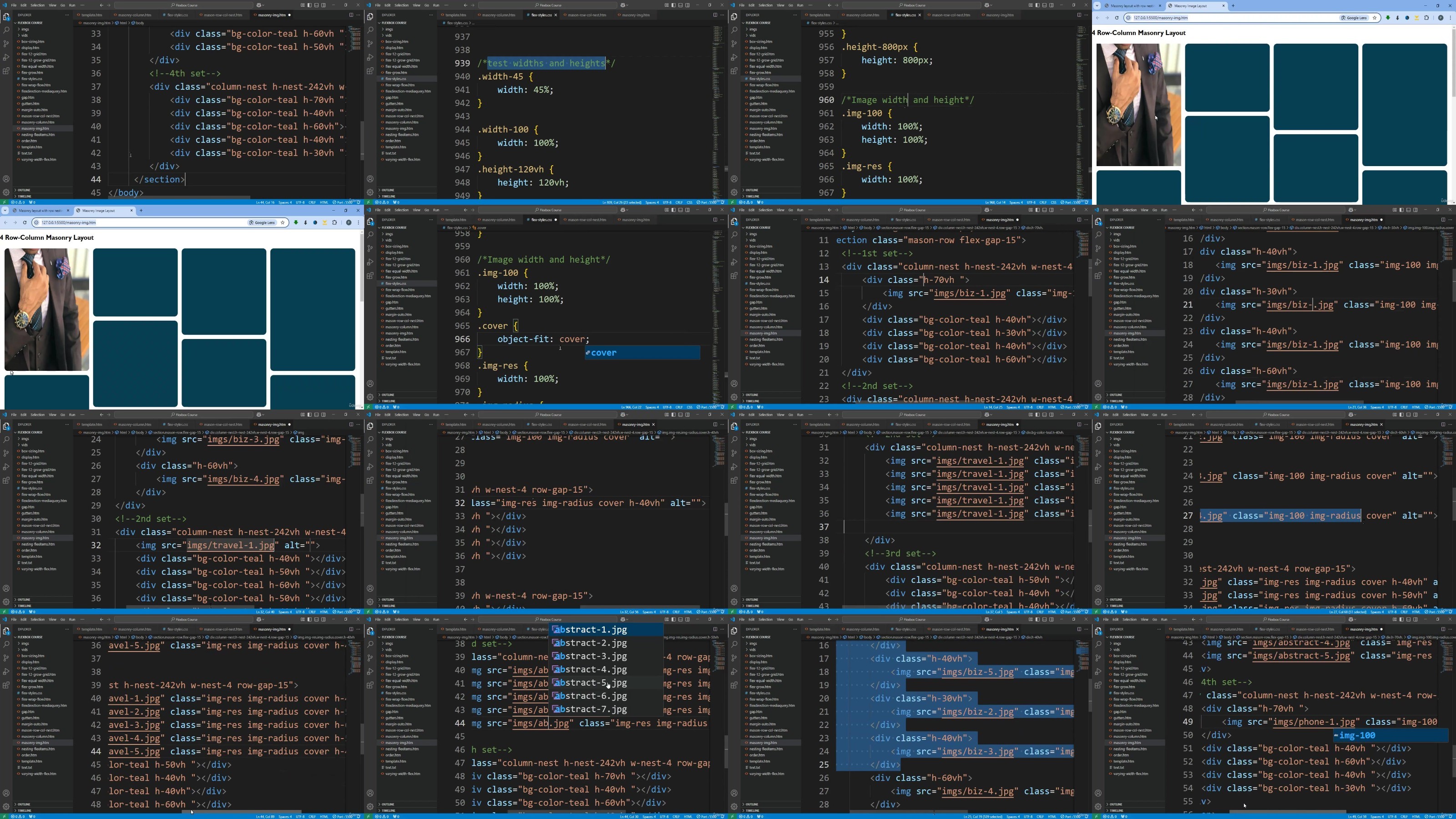
Lecture 72 Column wrap: Building the masonry framework of the container and flex items
Lecture 73 Masonry Layout: 3 columns – column wrap
Lecture 74 Masonry Layout: 3 columns – column wrap: Responsiveness
Lecture 75 Masonry Layout: 4 columns – column wrap
Lecture 76 Masonry Layout: 6 columns – column wrap
Lecture 77 Row nesting column: Building the masonry framework of container and flex items
Lecture 78 Row nesting columns – Masonry layout: structure of 4 equal columns
Lecture 79 Row nesting columns – Masonry layout: structure of 6 equal columns
Lecture 80 Masonry Layout – (row nesting column) – 4 equal columns
Lecture 81 Masonry Layout – (row nesting column) – 6 equal columns
Section 22: Flex shrink
Lecture 84 Flex-shrink of values of 1 upwards
Lecture 85 Flex shrink of value 0
Lecture 86 Comparing Flex shrink when flex items are on width value of %, em, rem
Section 23: Flex basis
Lecture 87 Flex basis on rows
Lecture 88 Flex basis on columns
Lecture 89 Flex basis versus width, max-width and min-width (row direction)
Lecture 90 Flex basis versus width, max-width and min-width (column direction)
Lecture 91 Structure of Equal flex items with flex-basis
Lecture 92 Equal flex items with flex-basis
Section 24: Flex shorthand property
Lecture 93 flex: [ <'flex-grow'> <'flex-shrink'>? || <'flex-basis'> ];
Section 25: Responsive flex layout with flex-grow flex-shrink flex basis without media query
Lecture 94 Responsive equal flex layout without using media query
Lecture 95 Responsive unequal flex layout without using media query
Section 26: Responsive Web Layouts without media query
Lecture 96 Web Layout (responsive)- Type 1
Lecture 97 Web Layout (responsive)- Type 2
Section 27: Justify content
Lecture 100 space-between, space-around, space-evenly
Lecture 101 Justify-content at different breakpoints
Section 28: Align content
Lecture 104 space-between, space-around, space-evenly
Lecture 105 align-content at different breakpoints
Section 29: Align items
Lecture 107 Center, baseline
Lecture 108 first and last baseline
Section 30: Align self
Section 31: Centering flex items Vertically and horizontally
Lecture 110 Horizontally/vertically center flex items in rows
Lecture 111 Horizontally/vertically center flex items in columns
Lecture 112 Align-items: center and justify-content: center
Section 32: Final Flex Project
Lecture 113 Introduction to the project
Lecture 114 Creating the web project folders and linking Google fonts
Lecture 115 Structure of the navigation
Lecture 120 Structure and styling of the footer
Lecture 121 Adding the navigation and footer to the watch page
Lecture 122 Customizing the scrollbar and track
Lecture 123 Home page: Structure of trending movies section
Lecture 124 Adding images to the trending movies section
Lecture 125 Styling the button and adding responsiveness
Lecture 126 Working on the suggested movies section in Watch page
Lecture 127 Home Page: Structure and styling of popular studio collections
Lecture 128 Structure and styling of Top rated movies section
Lecture 129 Watch page: Structure and styling of tv app logos
Lecture 130 Structure and styling of the watch movie section
Lecture 131 Structure of the movie details section
Lecture 132 Styling of the movie details section
Lecture 133 Responsiveness of the movie details section
Lecture 134 Final Wrap up
For a beginner in flexbox who wants to possess the skills and confidence to create complex, responsive layouts using Flexbox.
DDownload
https://www.keeplinks.org/p27/6873a6d2ee4e7
RapidGator
https://www.keeplinks.org/p27/6873afebe453b
NitroFlare
https://www.keeplinks.org/p27/6873b3c14a94d